Repositioning Commercial Bank for a Digital Generation
How Qatar's first private-sector bank translated its entrepreneurial heritage into a modern brand built for digital growth and a new generation of customers.

Commercial Bank opened in Doha in 1975 and helped shape the growth of Qatar's private banking sector. Its heritage was a genuine asset, but by 2013 the market had moved.
Qatar's economy was expanding quickly and a new generation of digitally empowered customers expected faster service, clearer value and a bank that understood their ambitions. The bank needed to appeal to those customers while protecting its entrepreneurial history, local credibility and established relationships.
The task was not a cosmetic update. Commercial Bank needed a brand capable of supporting a more modern, customer-centered and digitally capable banking experience.
Three things had to work together at once: the standing of Qatar's first private-sector bank, the expectations of digitally empowered customers, and a growing portfolio spanning retail, premium, corporate and digital banking.
The brand had to feel optimistic and contemporary while remaining recognizably Qatari. It had to work in Arabic and English, and stay consistent across branches, cards, websites, mobile applications, ATMs, digital screens, product communications and sponsorships.
- (01)Heritage: nearly four decades of trust had to be modernised without being discarded
- (02)Digital expectations: customers wanted faster, easier and secure self-service around the clock
- (03)Portfolio breadth: retail, premium, corporate and digital banking needed one coherent brand system
- (04)Bilingual consistency: Arabic and English had to carry equal weight across every touchpoint
Modernity did not require abandoning the bank's heritage.
The same entrepreneurial confidence that created Commercial Bank in 1975 could be reinterpreted for a digitally empowered generation. Qatar's own growth had made ambition feel achievable, and the bank had always been associated with enterprise and progress.
That shared belief produced a single promise: everything is possible.
Industry defined the new positioning, identity and brand architecture around the promise that everything is possible. It spoke to the country's confidence while committing the bank to help customers reach their own ambitions.
The four-crescent symbol was given greater prominence, and a color palette drawn from the Qatari sky at dawn, day, dusk and night expressed the bank's round-the-clock service. An Arabic calligraphic mark for Al Tijari was developed with typographer Mourad Boutros for premium banking applications.
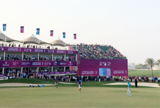
The identity was built as a flexible system rather than a fixed logo, so it could adapt across products, audiences, channels and different moments of the day. The strategy then carried into a full customer experience covering the website, bilingual content and information architecture, digital journeys, mobile applications, ATMs, interactive screens, branch design and sponsorship design for the Commercial Bank Qatar Masters.
Working inside the bank as Head of Brand and Design, I contributed to creative development and led implementation across customer-facing touchpoints so the strategy held its shape in the real world.
- Customer research
- Brand positioning
- Brand identity and architecture
- Bilingual digital experience and information architecture
- Websites, mobile applications, ATMs and interactive screens
- Branch design
- Customer collateral and product communications
- Sponsorship design
- Rolled the new identity across digital channels, aligning Arabic and English pages around faster secure transactions and 24-hour digital banking
- Applied the system to the website, mobile applications, ATMs and interactive screens
- Extended the brand into retail branches so the environment matched the digital experience
- Reissued cards, customer collateral and product communications on the new system
- Carried the identity into sponsorship design for the Commercial Bank Qatar Masters
The test was consistency: the identity had to stay recognizable and useful whether a customer met it in a branch, on a card, at an ATM, on a website, on a mobile screen or in a printed product document.
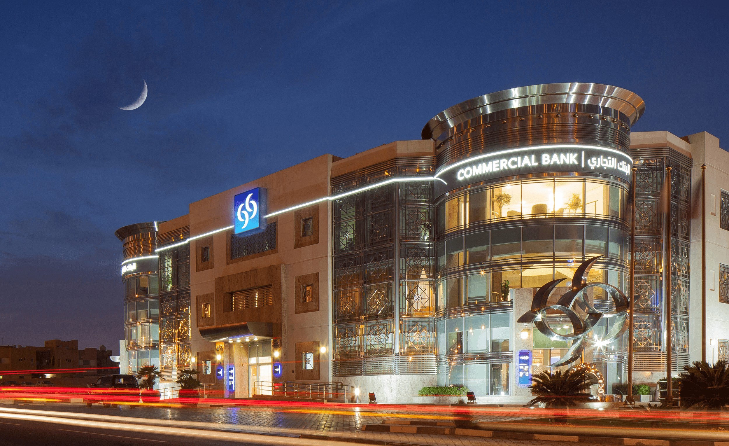
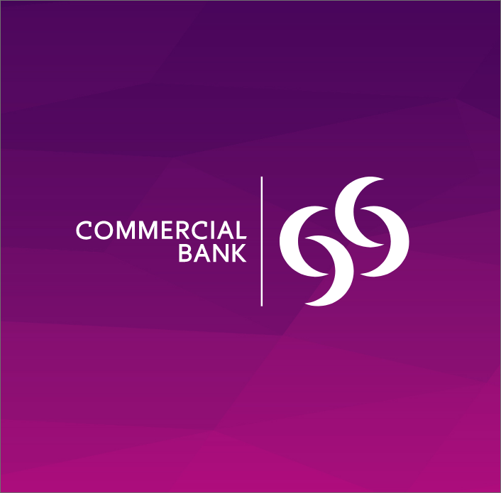
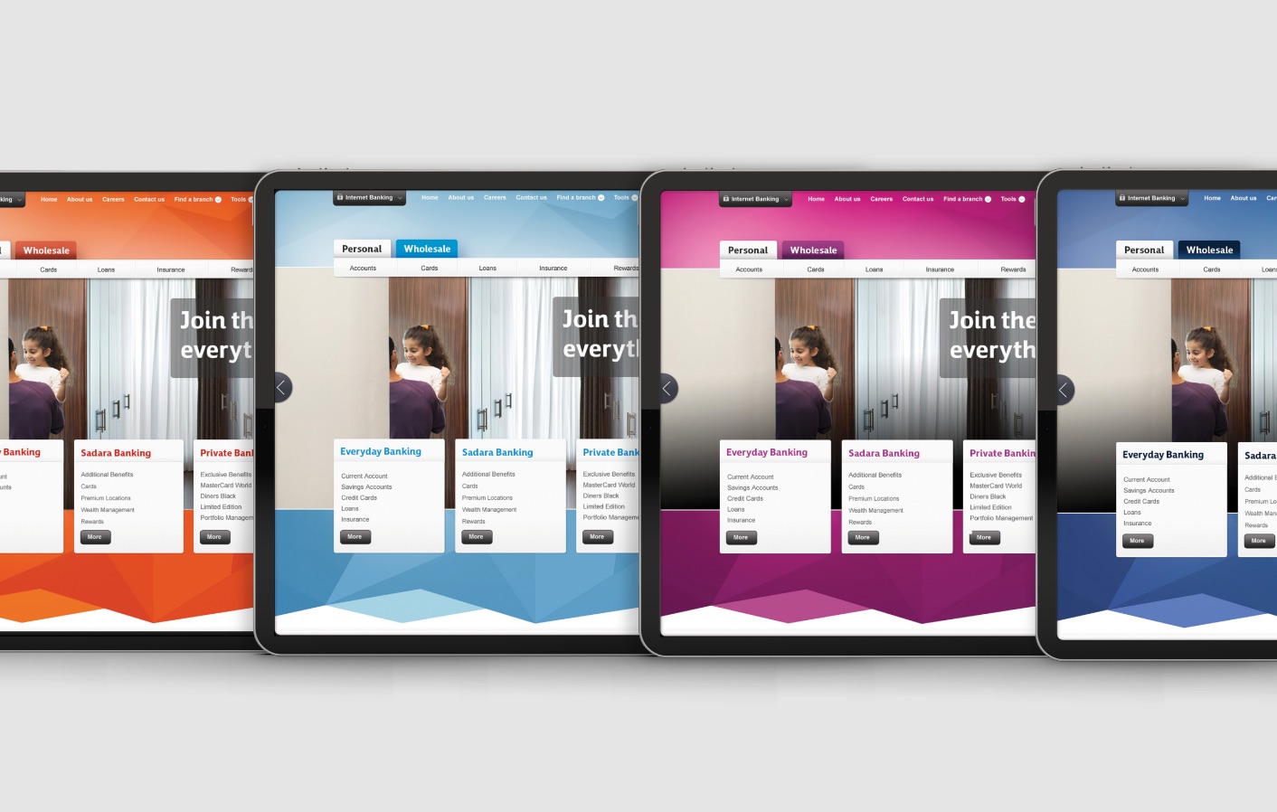
The transformation gave Commercial Bank a unified identity able to operate across physical, digital and sponsorship environments.
The rebrand won Gold in the Financial Services category at the 2014 Transform Awards, a Digital Impact Award and a REBRAND 100 Global Award.
It also created the platform for the next phase of work: turning the promise that everything is possible into a commercial communications system connecting customer ambition with products, services and everyday banking needs.
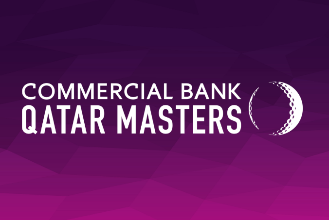

As Head of Brand and Design at Commercial Bank, I contributed to creative development and led implementation of the new identity across digital channels, customer collateral and retail branches, ensuring the strategy translated into a consistent customer experience.
- Client: Commercial Bank of Qatar
- Brand strategy, identity, architecture, digital experience, branch design and sponsorship design: Industry
- Arabic calligraphic mark: Mourad Boutros
- Advertising campaign: Leo Burnett
- Creative development and brand implementation: Houssam El Zein
- Project period: 2013 to 2014
Your institution is different. The problem usually isn't.